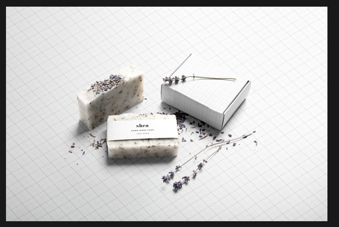
Design Portfolio: How to Showcase Your Packaging Designs
This tutorial will help you quickly create digital compositions for your packaging design portfolio using pre-designed mockups as a starting point.
By Guest Author — 29 July, 2020
Thoughtfully designed packaging is powerful. It can boost quality perception, consumer preference, and message credibility in ways that no other brand asset can. Beautifully packaged products are particularly important in e-commerce, where 100% of the brand experience takes place at a distance.
If you’re a designer working in this field, a significant part of the customer journey is in your hands. You excel at helping brands create moments of delight and it’s time to showcase that work in an equally exciting light. This tutorial will help you quickly create digital compositions for your packaging design portfolio using pre-designed mockups as a starting point. We’ll divide the work involved in four simple steps:
- Select the right mockup to work with
- License the graphic properly
- Adapt it to fit your creative vision
- Upload it to your digital portfolio
1. Select the right mockup to work with
The advantage of working with a pre-designed mockup is that so many elements of the composition have already been considered for us: layout, shadows, lightning, textures, and placement. You could, of course, produce a custom photoshoot to capture your packaging design’s overall look. However, going with a digital mockup template affords you more time to focus on the core part of your creative talent — whether that’s detailed illustrations, smart typography, or vibrant patterns.
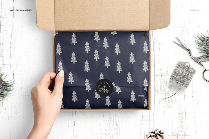
Consider the following aspects as you pick an asset to start out with:
Visual cohesion:
- What does your packaging design’s visual identity feel like? Define the visual style that sets your design apart and search for mockup scenes that already match that look — even if imperfectly.
- How can you complement the other designs in your portfolio with this mockup? Is there a particular photographic style, layout, texture, or color that can help you tie it all together? Does the creator offer a flexible pack that you can use to highlight more than one packaging project?
Physical context:
- Does your packaging’s use case play well with the mockup scene you’re considering? If you’re trying to highlight sticker, tissue, or tape design, does this mockup scene accomplish that?
- Do you want to create visual contrast? If so, what’s the right color, saturation, brightness to have your design truly stand out? If you’re aiming for low contrast, something subtle and understated, consider neutral tones and colors that match those of your designed package. The final result should look blended.
- Timing: Are you trying to infuse a seasonal aesthetic to this portfolio piece? What motifs and colors can you bring in to highlight the seasonal character of this packaging?
- File format: Define which design software you’ll use and find artwork that is available in it (Illustrator or Photoshop). Do you want an animated or static mockup? Both kinds are available in a variety of styles.
2. License the graphic properly
The creators behind these realistic mockups spend countless hours working so each scene complements your artwork perfectly and spares you the time involved in creating it from scratch. That’s why an important part of this process is making sure you license the asset correctly. Because you’re building a creative business with this visual, a Commercial license is appropriate. This page explains how to make sure you own the rights to use a specific mockup, honoring the creator’s intellectual property.
3. Adapt it to fit your creative vision
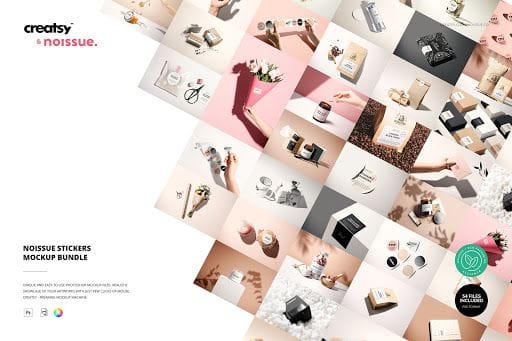
Now that you’ve found, licensed, and downloaded the mockup scene of your choice, it’s time to get creative. Open the file in your preferred design app and edit away. In this example, I’ll go over some of the tweaks you can make in Photoshop using the Noissue Stickers Mockup Bundle designed by creatsy. These are hyper-realistic, static mockups that specifically showcase sticker designs.
Most Photoshop mockup templates rely on Smart Objects to facilitate file placement. You’ll recognize Smart Objects because they display the icon below:
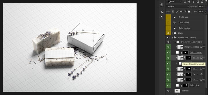
To add your sticker design, all you need to do is double click on the Smart Object layer and paste the composition in the new tab that opens up.
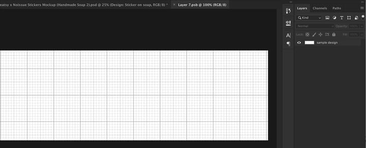
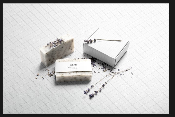
Upon saving, you’ll see an updated scene with your artwork incorporated. For the purposes of this tutorial, I’ll be using Nonola’s Örn Product Label Pack.
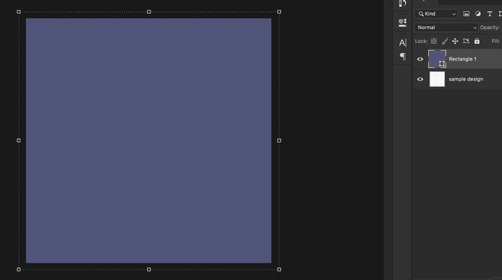
You’ll get a chance to adjust each object in the composition to add all kinds of artwork — from a simple type lockup to an intricate illustration. I placed more label artwork on the shipping box and layered simple purple rectangles on the shipping box and background Smart Objects:
As soon as you save these Smart Objects you’ll see the mockup template in its full glory: realistic lighting and shadow effects have all been taken care of.
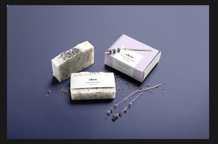
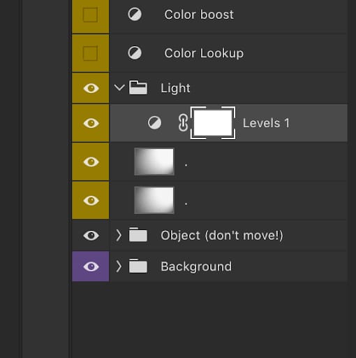
At this point, the mockup uses out-of-the-box settings. The beauty of a well-built template is that you can easily tweak these settings to fit your visual style. Let’s say I’d like my scene to be a bit darker. I’d double click on “Levels” under the “Light” layer group:
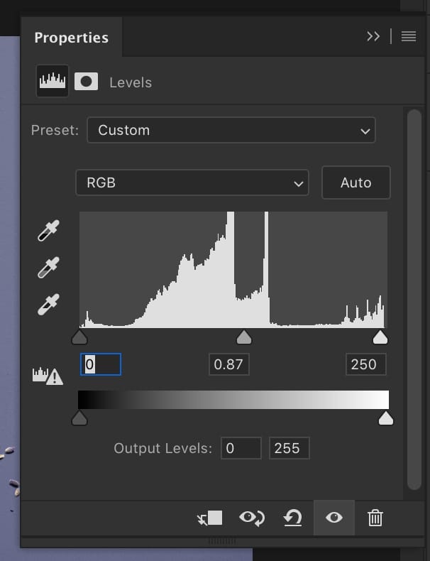
Then, I’d adjust the Levels output slider to make Midtones (the 0.87 value you see below) a little lower.
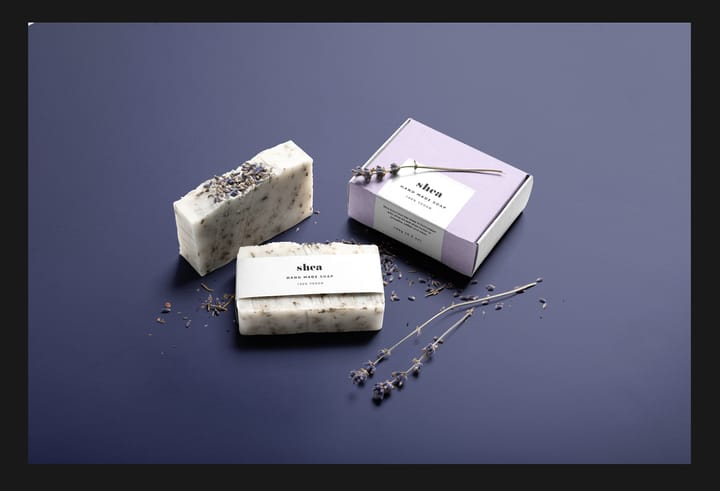
Here’s my slightly darker scene:
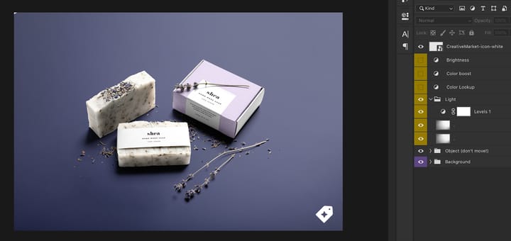
You can also layer in additional effects, like a Camera Raw filter of your choice. Creating signature color settings or layer styles and adding them to every piece in your portfolio can help create a cohesive look, no matter how different each project is. You may also want to watermark or brand each scene to make sure that, no matter where it’s shared, viewers are always led back to you. Just create a new layer and add the badge, text, or logo of your choice.
4. Uploading it to your digital portfolio
There are many different ways to build an online portfolio site, and the list keeps growing. We recommend using Dribbble to upload and share your packaging designs. This platform now has over 6 million monthly active users and a job board that connects seamlessly with the work you feature. Give it a shot (pun intended) and upload your best work!
Go ahead, amaze them.
Compelling packaging designs can be aspirational: someone looks at your work, imagines what it would feel like to see their brand there, and gets in touch to make it happen. With these four simple steps, you’ll be on your way to building a truly persuasive packaging design portfolio.
Laura Busche is the author of the Lean Branding book. Her approach to branding is blended, combining insights from an undergraduate degree in business, a master’s degree in design management, and a Ph.D. in consumer psychology. Laura is a Brand Content Strategist at Creative Market.