8 Ways to Use Line Art in Packaging
Line drawings are anything but plain! Here are some awesome examples of how you can use this minimal art form in your custom packaging.
By noissue — 16 September, 2021
@nnicolesart
Line art is taking over design, one line at a time. ✏️〰
They may sound simple, but line drawings are anything but plain. The humble line can result in stunning pieces of art that beautifully convey strong messages via uncomplicated imagery.
Back to basics line art focuses on clean lines and contrasting colors (with limited detail and zero shading!) to create monochromatic illustrations full of character and heart.
But it’s not a style simply reserved for straightforward doodles – even the most intricate of designs can be magically created from a simple line. Whatever you want, a line can create it – and all with the teeniest amount of fuss.
A statement piece that’s perfect for minimalist enthusiasts? Line art is an oxymoron that ticks all the boxes.
Inspiration Station ✨
Custom noissue Tissue is the perfect canvas for line art, making for branded and eco-friendly packaging that packs a punch!
Want to liven up your business's packaging with line art? Here are some awesome examples of how you can use this art form in your custom packaging to inspire your community and wow your customers.
Classic Color Combos
Black and white – can you name a more iconic duo? Not only do these two scream timeless sophistication, but they’re also THE classic combo for line art. A perfect mix of color to showcase either a detailed or unpretentious line design, you can be sure the focus is 100% on your on-point illustrations.
Look at how flawlessly Doster Paper Company has incorporated emblematic imagery into a line art design. It’s like your very own coloring book arriving in the mail – we defy any customers not to be tempted to pick up the coloring pencils and get shading! Proof that even when muted, patterned line art creates real depth – minimalism at its finest.
Crank Up The Contrast

Love the black and white color scheme but looking for something just a tiny bit different? There’s no doubt that black and white will always be a classic pairing – both in fashion and in packaging – but the simple act of inverting this combo can really set your designs apart from all the rest.
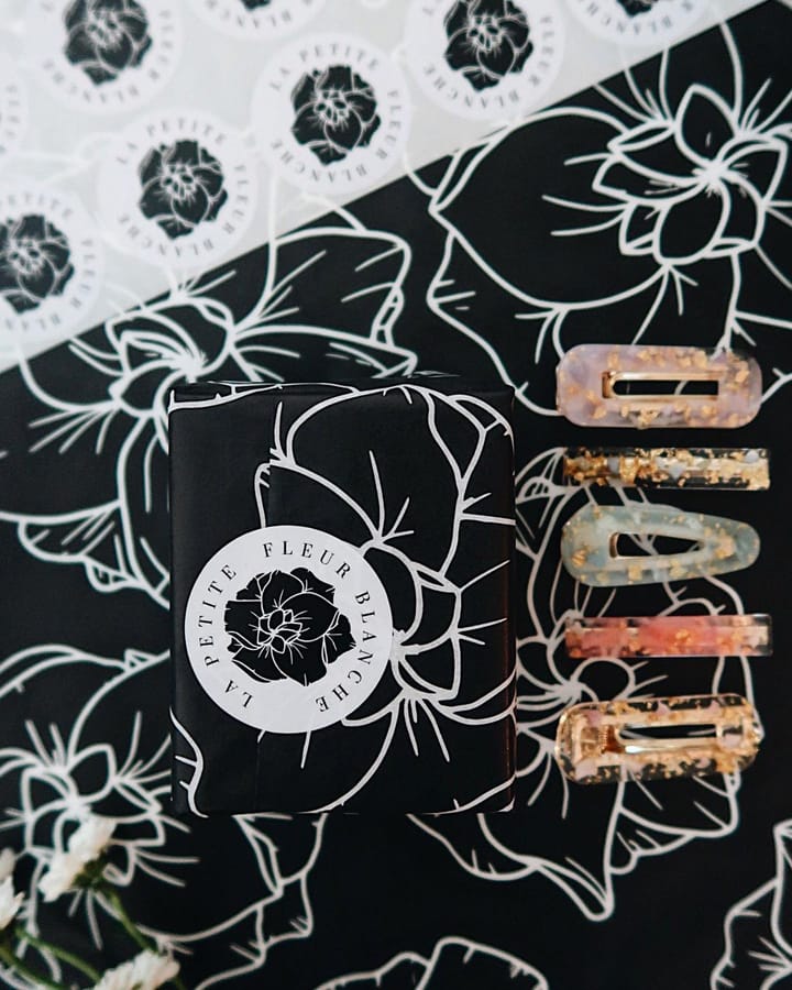
With a black background and gorgeous white line illustrations, these stunning white gardenias are brought to life on La Petite Fleur Blanche's noissue custom Tissue and Stickers. This classic preserved flower biz from Fort Worth, uses an original organic design to capture the sleek and stylish essence of their brand. All this through black and white lines? Who knew two colors could be so badass!
Dial Up The Detail
Line art is such a versatile little guy that you can either keep it simple or choose to keep adding more more more! Fine lines look stunning when layered over each other, especially when extra colors add a further dimension. Deviating from the traditional black and white designs adds a whole lot of personality and punch. You could use a color that matches other branding to tie everything together, or simply add a splash of fun to your designs.
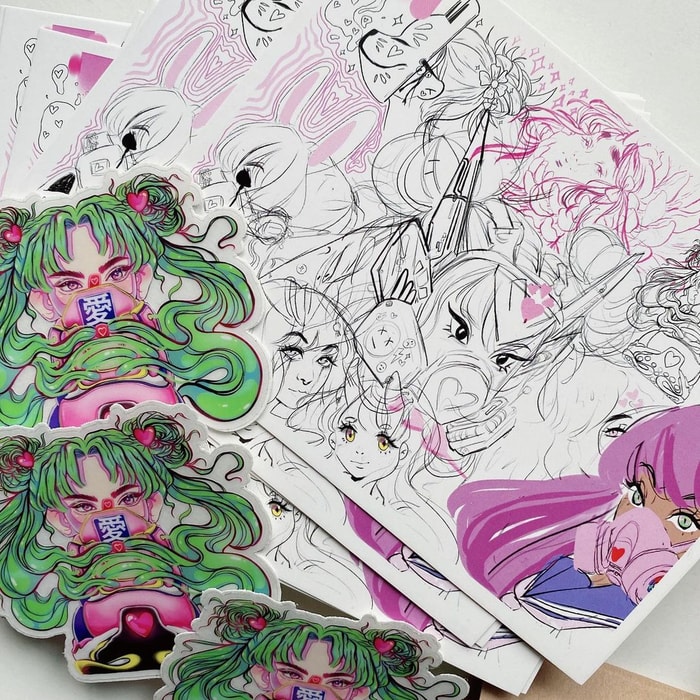
See how artist and designer Nicole of nnicolesart’s creativity shines through her noissue custom Card design - as does her love of pink! Now that’s a sophisticated and intricate design with just the right amount of romance. Adding a custom card allows you to share some of your personality and branding through your packaging. Stunning!
Creative Color
Maybe monochrome isn’t your bag? If you’re a color fan at heart or if your brand already has strong ties to particular shades, then don’t fear! Line art looks just as stunning in other colors, especially those that contrast a dark and light shade.
Just look at these fine lines and floral details in botanical illustrator Shannon of typoflora’s custom noissue Tissue! We love the contrast of teal and peach on this packaging - truly remarkable! Not to mention the complimenting sticker which is just as delicate and eye-catching. Now that’s a refreshing duo!
Logo Love

Line art logos are so hot right now – it’s an easy way to stay on-trend and they work equally well with or without text. And while many logos of this style are monochromatic, some brands love to add a pop of color to make their logo shine. It’s just whatever works for you and your brand.
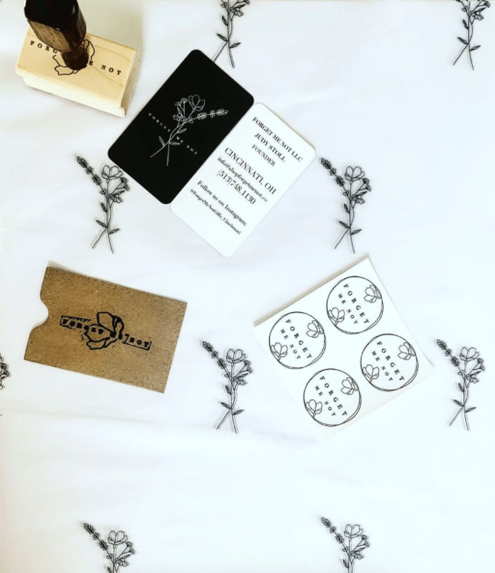
Simply using line art logos and designs across a range of custom options like this packaging inspo from Forget Me Not Custom Gifts can create an unforgettable unboxing experience that is aligned with your brand. Their intricate floral design on white tissue paper gives off a refined and timeless look. Classic, cute, cohesive – from the tissue paper to the stickers – everything's so on point!
Perfect Patterns

The first thing to pop in your head when we say the word ‘pattern?’ If it’s ugly wallpaper or your grandma’s curtains, then it’s time to change that thought process! Modern patterns are all the rage right now, and they are an amazing way to strengthen brand identity and style. Line art pattern design is even more perfect for those who are looking for less in-your-face and more delicate deliciousness.
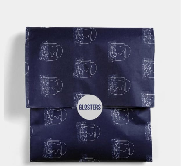
Ceramic homeware brand Glosters Pottery created a mug-inspired line art pattern on a navy blue background for that elegant and on-brand feel. There is no design element as versatile as a pattern – especially when it’s this cute. When designing your wrapping paper, it's best to add elements that speak about your products and reflect who you are.
Versatile and Victorious
When it comes to packaging, it’s not what’s on the inside that counts. An engaging unboxing experience can begin the moment your parcel is in the hands of your customers. All you need to jazz up a plain brown box? Some gorgeously designed line art labels!
We are on cloud line with this tape and stamp combo by children’s product brand Emerald Jungle. Customized Tape is the perfect way to show off your brand’s personality the moment it drops through the mailbox. With small delicate illustrations, nothing is overwhelming and everything is welcoming. Now is time to take things back to understated elegance. Go for it!
Pump Up The Playful
@noissueco @ellecreate_ is definitely ready for the #summer 🕶️☀️ Featuring her noissue custom Tote! #fyp #foryou #foryoupage #hotgirltotebag #noissuepackaging
♬ BORN FOR THIS - Foxxi
Line art is so alluring you’ll want to slap your designs on literally everything. It’s a style that is both simple and powerful enough to adorn all kinds of items, from stickers and tape to tissue and boxes, all with an understated air of pure charisma. Talk about versatility!
For something literally outside the box, check out Liverpool based illustrator Elle of ellecreate_’s beautiful line art on a custom tote bag! The noissue Totes are printed on 100% cotton and use water-based inks – you can be sure they are certified eco-friendly, reusable, and fully customizable! Sexy, sustainable and a walking promotion for your brand all rolled into one? What’s not to love?
🎁 That’s A Wrap!
Our packaging isn’t just perfect for line art, it’s perfect for the planet too. If you’re a brand that champions sustainability and does its best to be eco-conscious, then adding zero-waste custom packaging will well and truly complete your brand's vision. The world is ever-evolving but we can all support it through products that do more good than harm to our environments.
Who knew lines could be so sexy? Get designing, get making, get tagging us on Instagram and Pinterest. We can’t wait to see your creations come to life using a simple line.