True Colors
What’s in a color? For many decision-makers and designers, the answer could be: everything!
By noissue — 22 February, 2018
What’s in a color? For many decision-makers and designers, the answer could be: everything! Which is why it’s so incredibly frustrating when the piece you’ve designed goes to print and comes back with the colors all wrong. To be clear, we’re not saying wrong as in “I specified pink and it came out blue.” But those subtle changes in color from your design to the finished product can mean at best an inconvenience, and at worst a full-blown reprint. It’s not uncommon to see color on a company website that doesn’t quite match their brochures or marketing material.

When color on product packaging isn’t quite the same, it creates a poor representation of a brand. You want to make sure that what you’ve created through your design process and what ends up in the hands of your customer are true to both your ideals and your intent.
Consistency is the key when it comes to color for customization, and in order to maintain consistency we need to understand how color is used across different mediums. One of the biggest realizations is that the color displayed on a screen is not necessarily the color that you’ll see in print. It is precisely for this reason that we use a simplified system for color identification: Pantone.
Which is what exactly, you may ask? Pantone created the Pantone Matching System – a color matching system that provides uniformity when producing color. This ensures color fidelity when transferring from a digital image to a printed product.

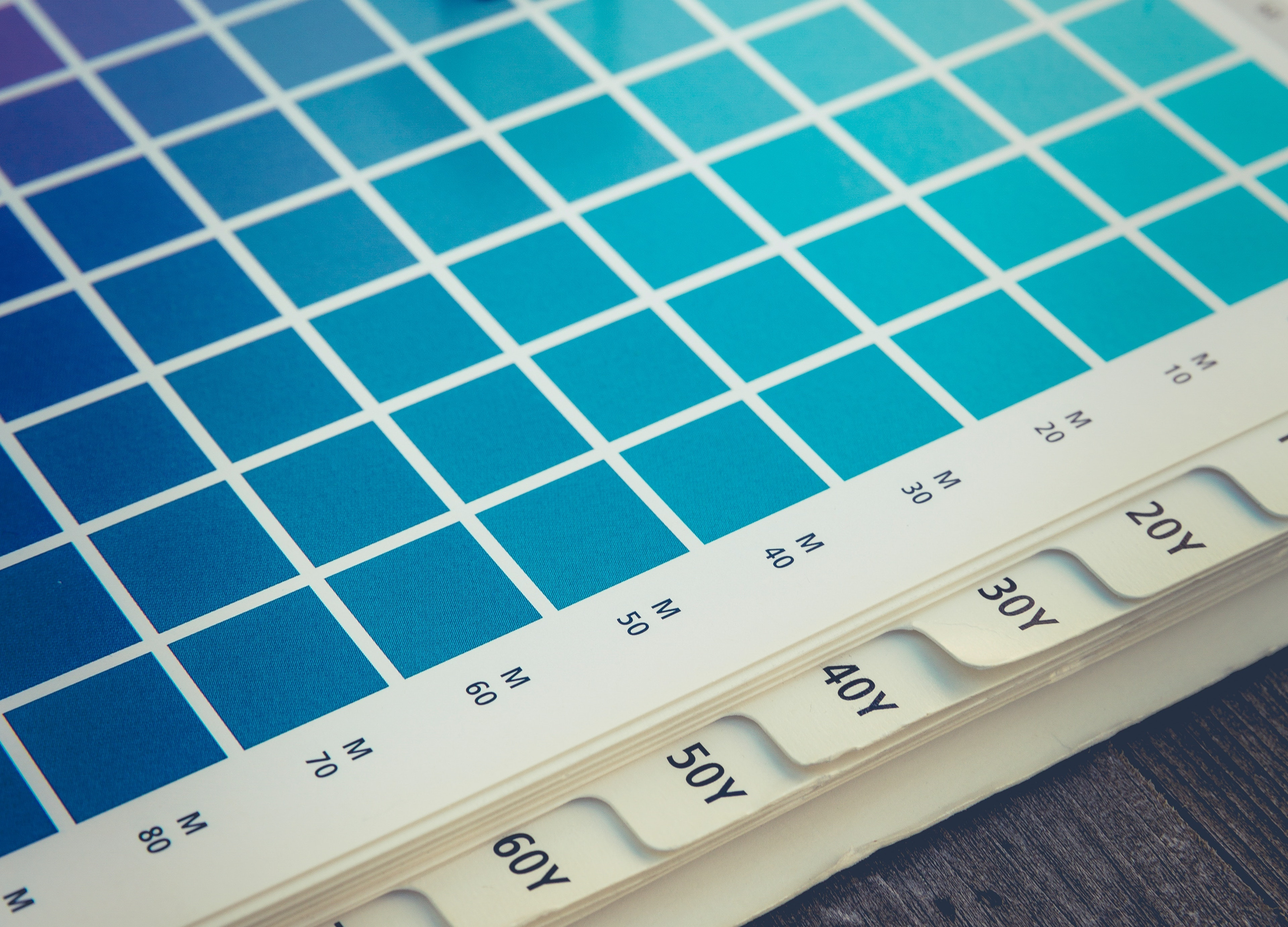
As we all know, color is a subjective topic, so the Pantone system takes the grey area out of color identification. While there are many different color standardization systems out there (CMYK, Hex, RGB, etc.), Pantone not only provides an easy to understand system for printers, but also colors outside of the CMYK range.
Our Custom Color Picker uses the Pantone Matching System to ensure true color fidelity for your prints. This feature allows you to search through a huge variety of colors in the Pantone range so you can find your brand color. It has a matching feature for hex codes, enabling you to search for your code and pairing it with the Pantone equivalent. Pantone colors not only produce brighter and more vibrant colors, they are also ideal for metallic or fluorescent colors. The ability to print metallic gold or silver is an incredible leap to take, especially when it comes to matching your branding, something that CYMK is unable to produce.
Upholding precise colors confirms both identity and the quality of your product. Knowing what you’re trying to achieve and the principles of color production can save you time and reworking. We always strive to make our process as user friendly as possible, enabling you to use a large range of colors and ensuring accuracy in the final print.
